The term Gestalt means ‘unified whole’, which is a good way of describing the over-arching theme behind the Gestalt principles. These refer to the way in which humans, when looking at a group of objects, will see the whole before we see the individual parts.
Gestalt Principles
Some of the most widely recognized Gestalt Principles include:
Closure (Reification): Preferring complete shapes, we automatically fill in gaps between elements to perceive a complete image; so, we see the whole first.
Continuation: We follow and “flow with” lines.
Element Connectedness: We group elements linked by other elements.
Meaningfulness (Familiarity): We group elements if they form a meaningful or personally relevant image.
Prägnanz: We perceive complex or ambiguous images as simple ones.
Proximity (Emergence): We group closer-together elements, separating them from those farther apart.
Regularity: Sorting items, we tend to group some into larger shapes, and connect any elements that form a pattern.
Similarity (Invariance): We seek differences and similarities in an image and link similar elements.
Symmetry: We seek balance and order in designs, struggling to do so if they aren’t readily apparent.
Synchrony: We group static visual elements that appear at the same time.

“Stop” workshop.
As we moved further, we were asked to design an autonomous graphic form that means ‘STOP’. The new Stop sign must not rely on existing symbolic conventions such as an octagon or a raised hand, a slash or an X, or literal conventions such as the word “stop”.
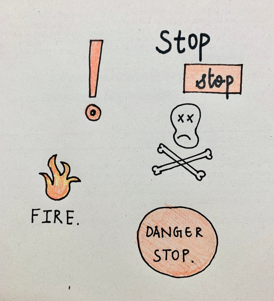
As you can see, on the left hand side i have put up some of my sketches of the ‘Stop sign’.
Logo designs.
Further more, we were asked to find 5 examples of logo designs that use the gestalt principles. The first logo that i found while researching was the Unilever logo. The Unilever logo also confirms well to the Gestalt principle of proximity. Since all the miniature icons are clustered together, the resulting bunch easily reads as a “U” in the logo mark. According to the branding minds behind this creative logo, the brand mark is meticulously designed to incorporate 25 icons intricately woven together, each depicting an important aspect of the efforts invested by the Unilever brand to render sustainable living commonplace.

Another example of a logo was the FedEx logo. Perhaps the hidden arrow in the FedEx logo is one of the most popular examples of the utilisation of negative spaces. Instead of having its own boundary lines, it borrows slyly from the borders of the “E” and the “x”.
In another example from Sun Microsystems, the SUN logo only constitutes a U and an upside down U, arranged in a loop. However, when together, the reverted “U”s look like they are forming the word “SUN” on all the four sides of the quadrilateral, and are part of the same logo.
For thr principle Continuity, our eyes follow a line naturally; when we see an object, we are automatically compelled to move through another object. For instance, our eyes follow from the C in Coca to Cola, continuing on from the C in Cola through to the L and A in the word. This visual aid helps our eyes continue to move through the word!

The figure-ground relationship explores the positive space and negative space relationship in design. Logo designers can use negative and positive space to create a visual hierarchy, to experiment with the principle of closure, to play with sizes and to also create an emphasis on things!
This is an example of a figure-ground relationship in design –it can look really interesting:
